D3.js Dashboard
Bubble Chart
Airbnb Occupancy Revealed | Bubble Chart Insights into Pricing, Demand & Performance Trends
Executive Summary
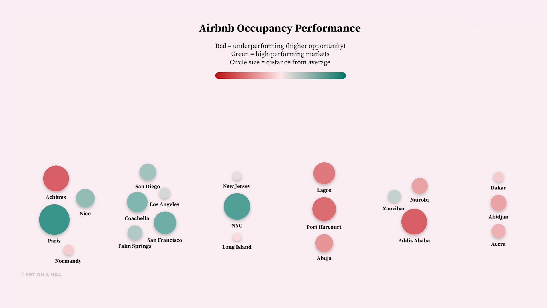
This visualization highlights relative Airbnb occupancy performance across global markets, using color and size to surface both high-performing regions and areas of untapped opportunity. Markets like Paris and New York City emerge as strong performers, exceeding the global average and indicating established demand and effective platform utilization. In contrast, cities such as Achères and Port Harcourt fall below average, not necessarily signaling weak demand, but rather a gap in how effectively the Airbnb platform is being leveraged compared to local alternatives. For an Airbnb executive, these underperforming markets represent strategic opportunities: lower occupancy may reflect competition from regional platforms, differences in user behavior, or limited platform adoption rather than lack of travel demand. For example, Port Harcourt’s performance suggests an opportunity to increase engagement and preference for Airbnb over local booking channels through localized product features, trust-building, and market-specific partnerships. Similarly, Achères may benefit from improved visibility, pricing optimization, or host education to better align with platform best practices. This view enables leadership to maintain momentum in high-performing markets while prioritizing targeted strategies that increase platform share and usage in regions with strong underlying demand but lower Airbnb penetration.
The analysis uses a global average occupancy rate of approximately 70% as a baseline to compare market performance. Rather than displaying raw occupancy alone, the visualization encodes each city’s performance as a deviation from this average, allowing for clearer relative comparison across regions. In this approach, a value of “0” represents the global average, while positive values indicate above-average performance and negative values indicate underperformance. This deviation is then mapped visually: color reflects direction (red = below average, green = above average) and circle size represents magnitude of difference from the average. By normalizing the data in this way, the visualization emphasizes opportunity and performance gaps more effectively than absolute values, making it easier to identify markets where Airbnb may be underpenetrated relative to demand.
Racing Bar Chart
Explosive Travel Growth 🌍 Racing Bar Chart of Global Platform Users Over Time + Data Table
Executive Summary
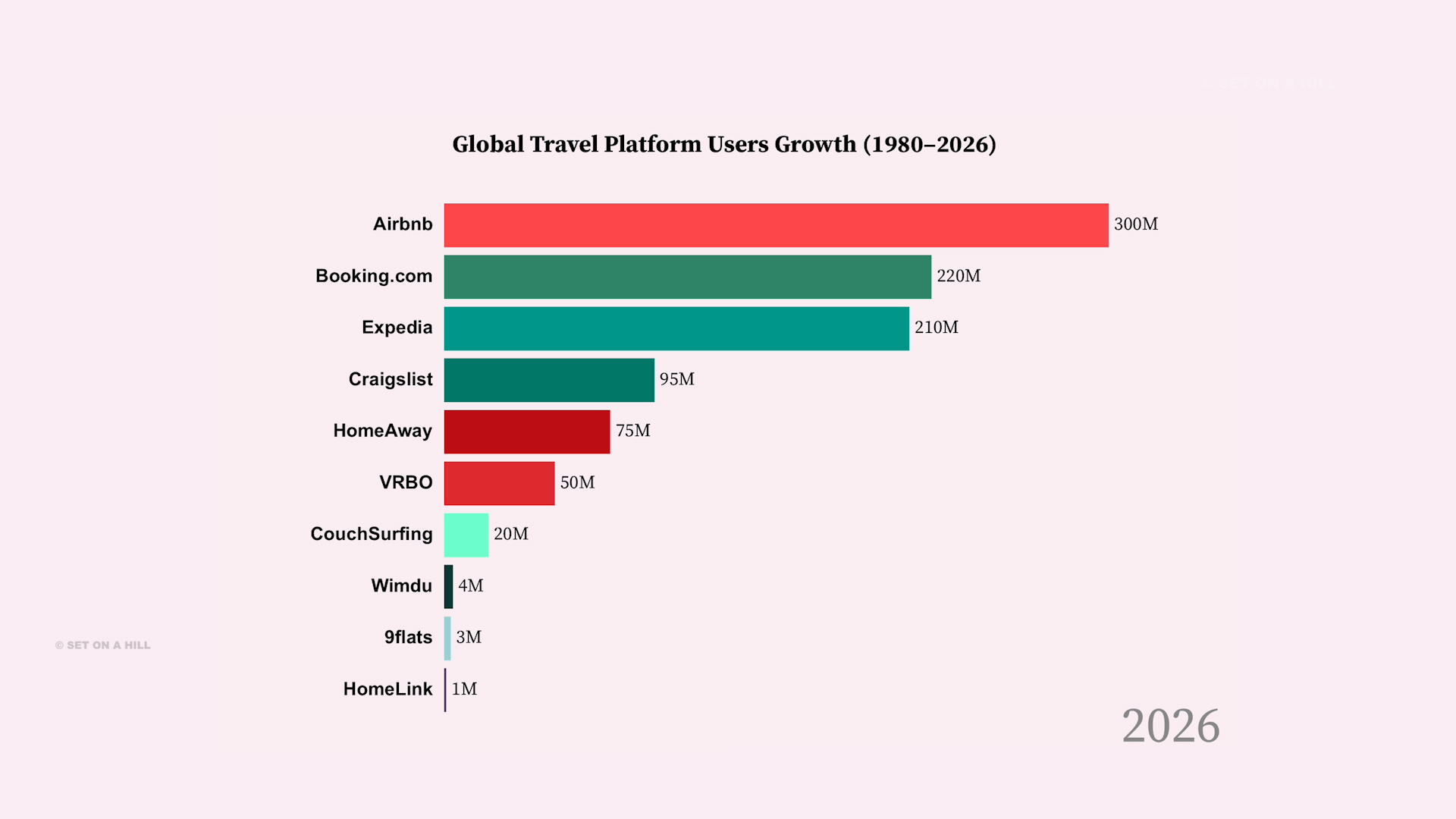
This dashboard visualizes the growth of major global travel platforms from 1980–2026. The racing bar chart highlights shifting market leadership over time, while the table provides exact user figures for comparison.
This dashboard visualizes the growth of major global travel platforms from 1980–2026. The racing bar chart highlights shifting market leadership over time, while the table provides exact user figures for comparison.
This project leverages D3.js to build a dynamic, animated bar chart race that visualizes the growth of global travel platforms over time. D3 is used to create and manipulate SVG elements, define responsive scales (scaleLinear, scaleBand), and bind structured data to visual components through its enter-update-exit pattern. The animation is driven by iterative frame updates, where each year’s dataset is sorted and re-rendered with smooth transitions, allowing bars, labels, and values to move fluidly across ranks. Additionally, asynchronous control (await with timed delays) enables a step-by-step playback of historical trends, effectively turning raw data into a storytelling experience. Complementing the chart, D3 is also used to generate an interactive heatmap-style table, where color encoding highlights magnitude differences, reinforcing insights through both motion and color.
Sankey Diagram
Airbnb vs Competitors 🔀 Sankey Diagram Showing User Flow, Market Share & Platform Shifts
Executive Summary
This Sankey diagram visualizes a conceptual flow of users across major short-term rental platforms, including Airbnb, Booking.com, Vrbo, and regional alternatives. The diagram represents a realistic model of how users might navigate across platforms. The width of each flow indicates relative user volume, showing where users continue through a platform, switch to competitors, or drop off entirely. Viewers are encouraged to hover over the flows in the chart, which dynamically highlight to make it easier to trace user movement and better understand how traffic shifts between platforms.
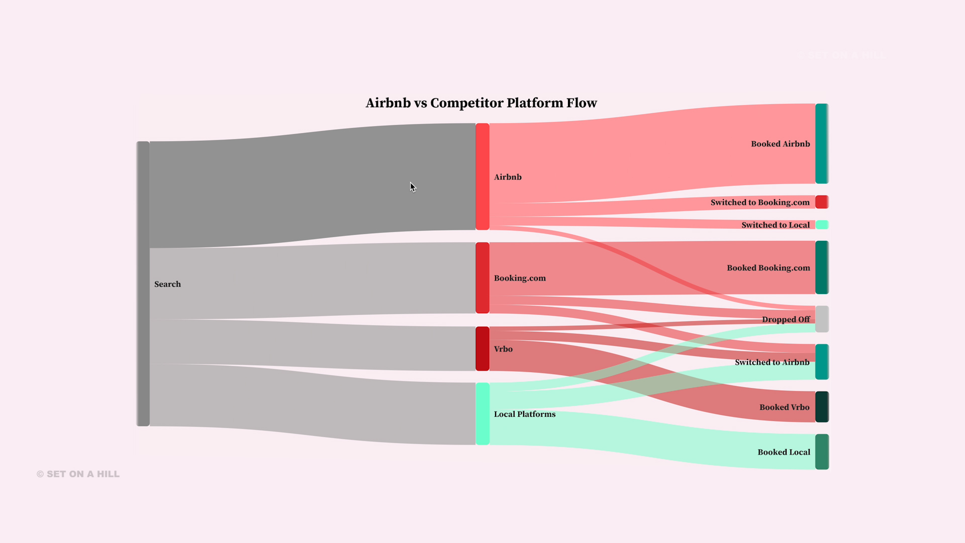
This Sankey diagram visualizes a conceptual flow of users across major short-term rental platforms, including Airbnb, Booking.com, Vrbo, and regional alternatives. The chart uses synthetic (illustrative) data rather than real-world figures, meaning it is not tied to a specific geography like the United States or a specific year such as 2026, but instead represents a realistic model of how users might navigate across platforms. The width of each flow indicates relative user volume, showing where users continue through a platform, switch to competitors, or drop off entirely. Viewers are encouraged to hover over the flows in the chart, which dynamically highlight to make it easier to trace user movement and better understand how traffic shifts between platforms. From a strategic perspective, thicker flows leaving a platform suggest potential areas of user loss and opportunity for improvement, while stronger inbound or retained flows indicate competitive strength and higher user preference. This type of visualization helps identify where platforms are succeeding, where users are fragmenting across options, and where targeted growth or retention strategies could have the greatest impact.
This Sankey diagram was built using D3.js and the d3-sankey extension to transform raw user flow data into a structured visual representation of platform behavior. D3 is used to dynamically generate SVG elements, construct nodes from link relationships, and compute layout positions through the Sankey generator, which maps proportional flow values to link widths. The implementation applies D3’s data-binding and join pattern to render and update links and nodes efficiently, while interactive features such as hover opacity and color encoding enhance usability. This integration enables a clear, data-driven visualization of user journeys, highlighting conversion paths, switching behavior, and drop-off points across platforms.
Choropleth Map
Who Takes the Most Time Off? Choropleth Map of Vacation Days
Executive Summary
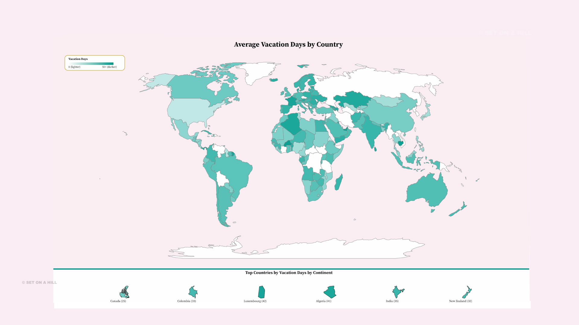
This Choropleth Map visualizes the global distribution of average vacation days by country, using compiled real-world data from international labor policy benchmarks (e.g., OECD guidelines, statutory leave policies, and regional labor standards). From a data perspective, the map highlights how countries with more regulated labor markets tend to mandate higher minimum paid leave, resulting in significantly greater vacation time compared to less regulated economies. From a business and strategy lens, this insight is highly actionable: when recruiting travel partnerships, targeting countries with both higher vacation availability and geographic proximity to key accommodation hubs can drive stronger engagement and conversion. These markets often represent untapped demand, especially when aligned with destinations that have a high vacancy of unused rooms, creating clear opportunities for optimized marketing strategies, pricing models, and overall occupancy growth.
Built using D3.js, this interactive visualization leverages techniques such as geographic projections, TopoJSON mapping, animated transitions, and dynamic color scaling to clearly communicate patterns across regions. The darker the color, the higher the average vacation days, allowing for immediate visual comparison.
Bipartate Network Graph
Global Content Dominance on Apple TV: A Country-Level Network Analysis
Executive Summary
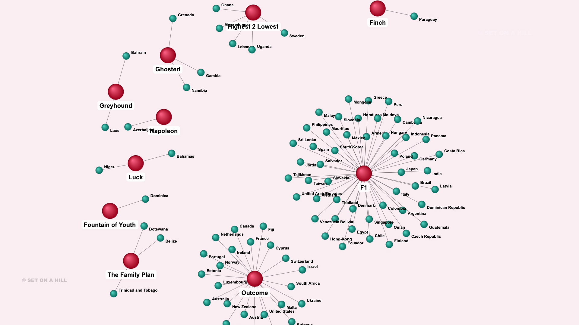
This is a bipartite network graph, meaning it visualizes relationships between two distinct groups—in this case, Apple TV movies and countries—where connections only exist between groups (a country links to its top movie), not within them. This structure allows us to clearly see which titles dominate globally and how viewing preferences cluster across regions. Instead of scanning a table, this format makes it immediately obvious which films (like F1) act as “gravity hubs” with many countries orbiting them, versus smaller, more localized titles. The purpose of organizing the data this way is to surface patterns, concentration, and global reach at a glance, making complex distribution data intuitive and actionable.
This visualization was built using D3.js (v7), leveraging a force-directed simulation (forceSimulation, forceLink, forceManyBody, and forceCollide) to naturally cluster countries around their associated movies while maintaining separation between groups. Additional techniques like collision detection, radial gradients for 3D sphere effects, and dynamic label positioning improve readability and visual hierarchy. The key takeaway is that this graph helps guide strategic decisions: it reveals which content has global appeal (supporting large-scale investment and marketing), where regional preferences differ (informing localized content strategy), and how to allocate promotional resources efficiently based on cluster size and influence.
Bar Chart
Gluten-Free Boom 🍞 Bar Chart Showing Rapid Growth Across Cities You Need to See Today
Executive Summary
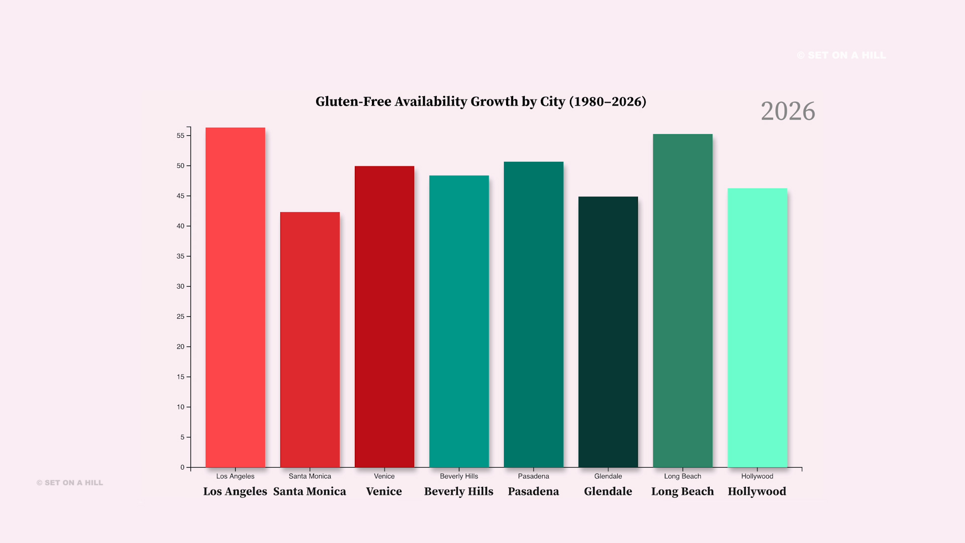
This animated bar chart was built using D3.js to visualize time-series growth across multiple cities. D3 is used to generate and manipulate SVG elements, define band and linear scales, and render axes, while data binding drives the creation of bars and labels. Smooth transitions and timed updates (d3.interval) animate yearly changes, creating a dynamic view of trends over time. Additional styling, such as drop shadows and custom color mapping, enhances visual clarity and user engagement.
D3.js to p5.js Multimedia
Stained Glass Animation
D3.js Stained Glass Animation | Generative Art Rain Visuals
- Built twelve custom polygons using JavaScript and D3.js.
- Generated responsive Voronoi macro-cells with D3.js geometry.
- Tessellated regions into procedural D3.js micro-triangles.
- Animated the central polygon using JavaScript motion logic.
- Balanced procedural randomness with curated color palettes.
- Enhanced visuals in Adobe Premiere Pro with Lumetri Color.
- Added rain ambience and cinematic stained-glass atmosphere.




Music in the Cosmos
p5.js Interactive Canvas Music in the Cosmos



D3.js Generative Art
Metamorphose Amorphous Sound Responsive Shape
Sound Comes Alive 🎧 D3.js Amorphous Shape Reacting to Audio in Real Time Data Visualization
Radial Wave
D3.js Radial Wave Animation | Optical Illusion Generative Art
Sunset Wave
D3.js Sunset Wave Animation | Ambient Generative Landscape
3D Infographic
STEAM 3D Infographic
Interactive Infographic Animated for Education
Music Festival Infographic
Mobile Phone Company Infographic on Phone Usage
Graphic Design
Pitch Decks
Film & TV


BENCHED
Pitch Decks
Craft compelling pitch decks that seamlessly blend strategic messaging with stunning graphic design. Leverage expert command of the English language and visual storytelling to create decks that are clear, persuasive, and investor-ready. Backed by a Business Administration background and deep experience in the filmmaking industry, ensure every slide speaks directly to what decision-makers want to see.


BENCHED
Social Assets

3D Animation
morning coffee
Storyboard + Character Design
Designed unique characters for the brand. Created a cohesive storyboard outline. Animated the characters and used Adobe Premiere Pro to finalize the edits. A number of techniques were used in this project. There are various options when it comes to animation and branding and we selected a 3D style that pairs well with the brand. A logo was then created from the characters and animated in the opening of this cartoon.


morning coffee
Character Design

Contact Information
Contact Ekaette Elizabeth, MBA
Ekaette Elizabeth Shammah, MBA
Based in Los Angeles, California
If you have questions please contact me at elizabeth@ekaettes.com
California Office: 
Corporate Phone:  – Please leave a message.
PRONUNCIATION
How to say Ekaette!
Ekaette is Nigerian-American. Her first name is from the Ibibio language in Akwa Ibom State, Nigeria. Ekaette is a very common regional Nigerian name. “It’s not about how perfect you say my name, it’s about trying! You can do it!” Check out the phonetic pronunciation below and then press play to hear the audio explanation.
Phonetically: A – Kite🪁- Tay